
Bordertown Redesign
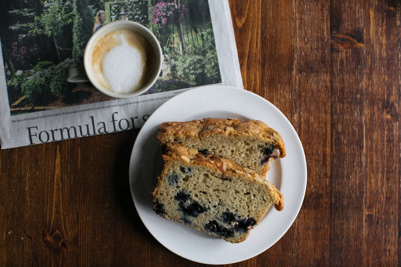
Located in Dinkytown, Bordertown Coffee occupies a 1929 frat house and has been a cornerstone of the community since 2004. Known for ethically sourced premium coffee beans, they offer a diverse menu featuring classic espresso, specialty drinks, teas, fresh juices, pastries, and lunch options. Our group (Kaci Kopf, Martha Vaughan, Emily Ulfig) has redesigned their existing website to better reflect the brand.
1
Before any redesign, we began the research process, which included user interviews along with market and brand research. From here, we were able to begin our ideation process of site mapping and wireframes.

Word map from user interview responses

Initial Wireframes
2
Redesign
Impact
We then moved onto concept testing where we gained user feedback for our wireframes and first redesign. Feedback on components such as our color palette and icons provided us insight that led to our finalized version.

Stylized icons to fit brand

Added header
Indented text ————————
Stylized bean icons
Before

Refined typography, icons, and color palette
No visual or textual hierarchy in hero image
No view menu button
Too much small text in one place
No hierarchy or visual cohesion
Attention-grabbing hero image & text
Featured drinks are displayed in a simple and effective way
Taking a break from images with stylized icons that highlight positive aspects of the company
Dynamic photo section that takes the user right to social media, since that’s where they’ll probably go to find more photos
3
Switched to off-white background


Options in header too wordy and not organized well
Missing photo
Static gallery
No footer
Simple and useful navigation
View menu and order now buttons
Sections are broken up using images with not too much text
Reviews section with highlighted words to help user skim through
Clean and organized footer with useful information
Established a hierarchy that guides user seamlessly through the website
Comfortable amount of information for user to feel satisfied
Showcased more images of food and atmosphere
Displayed featured reviews to help the customer feel more educated
Organized navigation tabs so the user can easily find what they’re looking for
Branding and imagery is visually pleasing and matches the shop’s warm and cozy vibe

Reorganized site map
Process

Ideating and organizing key insights